Escape the everyday and find your inner peace with this easy watercolor painting tutorial! Learn to create a serene beachscape, capturing the tranquil beauty of the ocean and shore in vibrant, yet calming hues. No prior painting experience is necessary; this tutorial is designed for beginners and those looking for a relaxing creative outlet. We'll guide you through simple techniques to achieve a stunning effect, focusing on blending colors and creating realistic textures to evoke the feeling of a gentle sea breeze and warm sand.
Imagine yourself already relaxing on a virtual beach, the gentle sounds of the waves washing over you as you bring your masterpiece to life. Let's dive into the step-by-step process and unlock your artistic potential with this relaxing and rewarding beachscape painting experience, ready to follow each easy step to recreate this beautiful scene.
Preparation and Safety Guidelines
- Bao Hong Academy cold press watercolor paper (140lb, 100% cotton, ~5x7 inches)
- Princeton Neptune size 8 round brush
- Silver Black Velvet size 8 round brush
- Princeton snap size 0 brush
- Paints (blues, turquoise, Cerulean blue, Prussian blue, sepia, burnt sienna, raw umber, yellow medium, black)
- Pencil (optional)
- Water jar
- Paper towels
- Heat tool (optional)
- Always work in a well-ventilated area. Watercolor paints and mediums can contain chemicals that are harmful if inhaled.
- Protect your work surface. Use a waterproof surface or cover it with a protective sheet to prevent water damage.
- Clean your brushes thoroughly after each use to maintain their quality and prevent paint from drying and hardening in the bristles.
Step-by-Step Instructions
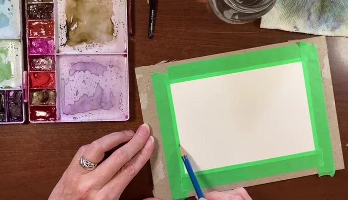
Sketching the Guide
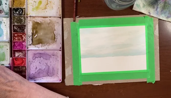
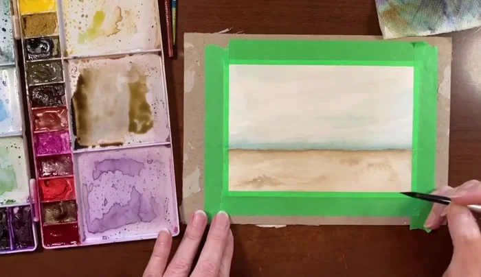
- Lightly sketch a horizon line about two-thirds down the page. This isn't a precise waterline, but a guide for the sky/sand division.

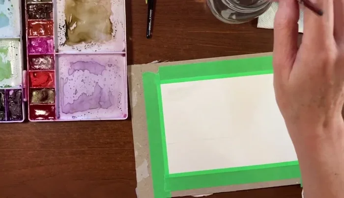
Sketching the Guide Wetting the Paper
- Wet the bottom two-thirds of the paper with clean water using your size 8 round brush. Tilt the board to help the water flow evenly.
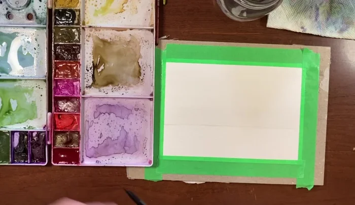
Wetting the Paper Applying the Sky Wash
- Apply a very light wash of a pale bluish-green to the top third of the paper (the sky). Use diluted blues and add a touch of Cerulean blue near the horizon line for a subtle gradient.
- Add a slightly deeper wash of turquoise and Cerulean blue along the horizon line, keeping the overall color light and airy.
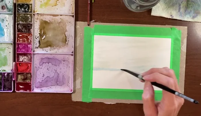
Applying the Sky Wash Deepening the Horizon Line
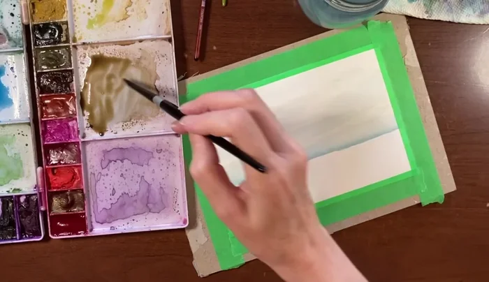
- Once the sky is mostly dry, deepen the horizon line with a mixture of Prussian blue (or a similar dark blue). Keep it subtle and avoid harsh lines.
Deepening the Horizon Line Applying the Sand Wash
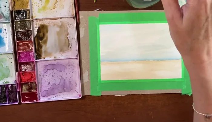
- Apply a diluted sepia wash over the wet sand area, allowing the colors to blend naturally. The wash should be light and even.
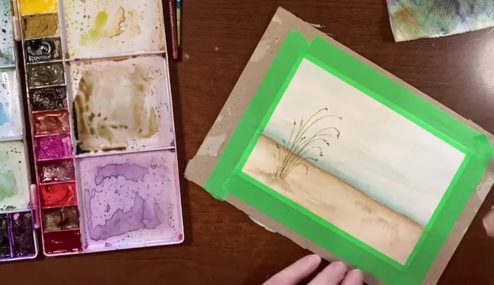
Applying the Sand Wash Adding Sand Texture
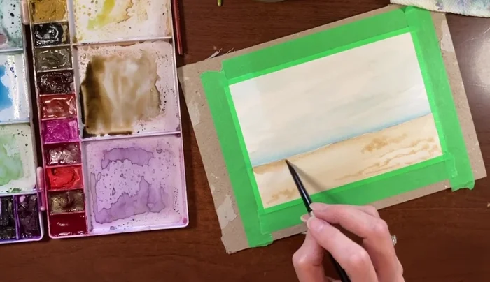
- While the sand is still damp, add texture using a mixture of burnt sienna and sepia. Tap the brush lightly to create varied tones and avoid over-saturation.
- Add depth to the horizon line using a slightly darker wash of the sepia/burnt sienna mixture.
Adding Sand Texture Painting the Beach Grass
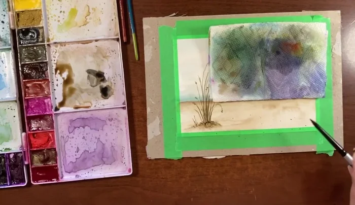
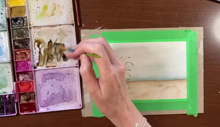
- Create beach grass using a mixture of raw umber and yellow medium. Use thin, controlled strokes with a small brush to suggest individual blades of grass.
- Add darker accents to the beach grass with a deeper sepia mixture, focusing on the bottom areas for depth and contrast. Use a very light touch to avoid overdoing it.
Painting the Beach Grass Adding Sand Texture and Depth
- Add a few subtle flicks of a diluted sepia/burnt sienna mixture to the sand to add texture.
Adding Sand Texture and Depth Adding Birds and Final Touches
- Finally, add a few simple birds in the sky using a dark brown/black mixture. Keep the birds simple and suggestive of movement.
Adding Birds and Final Touches
Read more: 7 Top Paint Color Trends for 2024: A Complete Guide with Free Downloadable Resource
Tips
- Keep the colors and values minimal for a calm, serene effect.
- Control water usage to avoid creating unwanted blooms (uncontrolled color spreads).
- Use a smaller brush for finer details and more control.
- Don't worry about perfectly straight lines; the painting should have an organic feel.
- Allow layers to dry slightly between applications to prevent colors from bleeding excessively.