Atmospheric perspective, that subtle shift in color and detail as objects recede into the distance, is a crucial element in creating realistic and evocative landscape paintings. Mastering this technique can elevate your digital artwork from flat to breathtaking, imbuing your scenes with depth and a sense of atmosphere that truly captures the viewer's imagination. Whether you're a seasoned digital artist or just beginning your journey with Procreate, understanding and implementing atmospheric perspective can dramatically improve your landscape pieces. This is particularly true when working in Procreate, which offers a powerful and intuitive interface for such delicate effects.
This tutorial will guide you through a step-by-step process of applying atmospheric perspective in Procreate, transforming your landscapes from simple representations to immersive and believable worlds. We'll explore techniques for adjusting color saturation, value, and brushwork to create the illusion of depth and distance, ultimately enhancing the mood and realism of your digital paintings. Let's begin!
Preparation and Safety Guidelines
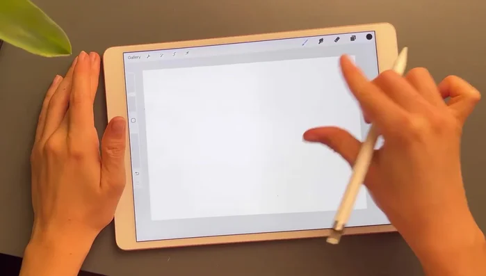
- iPad
- Apple Pencil
- Procreate App
- Regularly save your work! Procreate's autosave is helpful, but manually saving frequently prevents potential data loss.
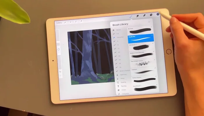
- Experiment with different layer blending modes to achieve subtle atmospheric effects. Don't be afraid to try 'Multiply', 'Overlay', or 'Soft Light' to blend colors and create depth.
- Start with a rough sketch to plan your composition and value structure before focusing on detail. This makes applying atmospheric perspective much easier.
Step-by-Step Instructions
Sketching the Landscape
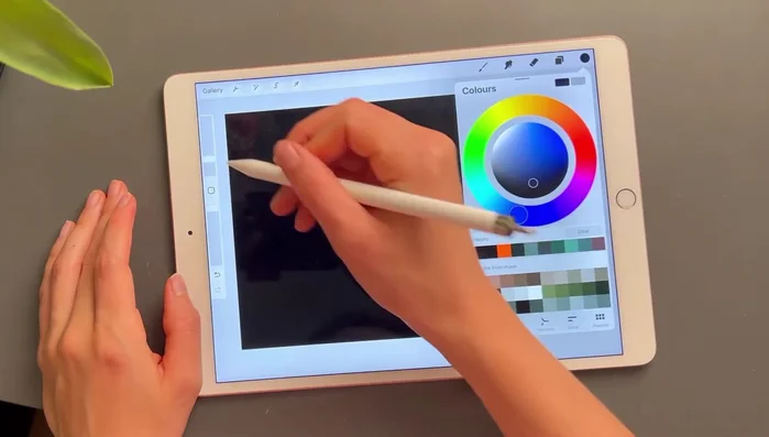
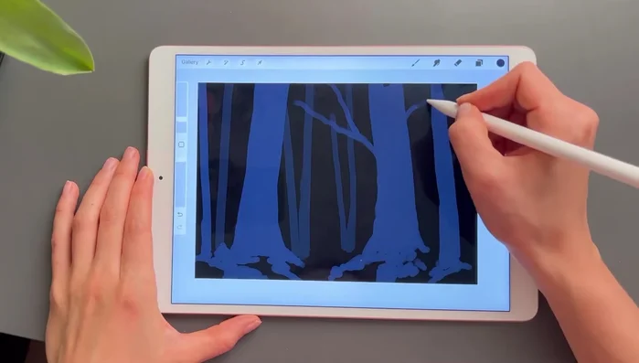
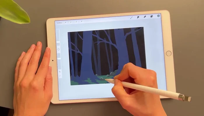
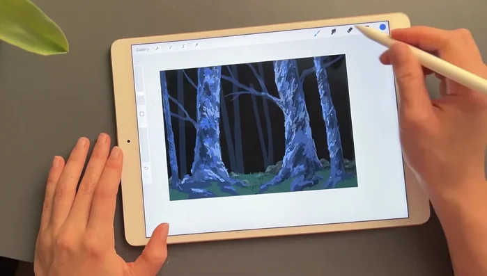
- Start with a black background.
- Add trees using a square brush with a hollow middle section to define basic shapes.
- Paint chunky roots to define the earth around the trees.
- Add branches using the same square brush.

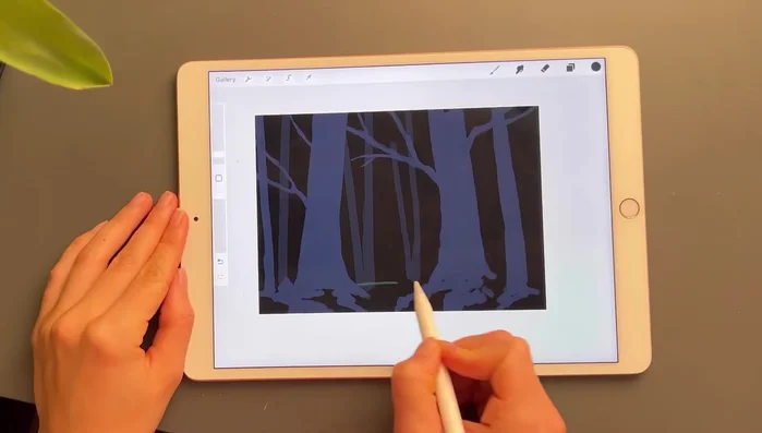
Sketching the Landscape Layering the Background
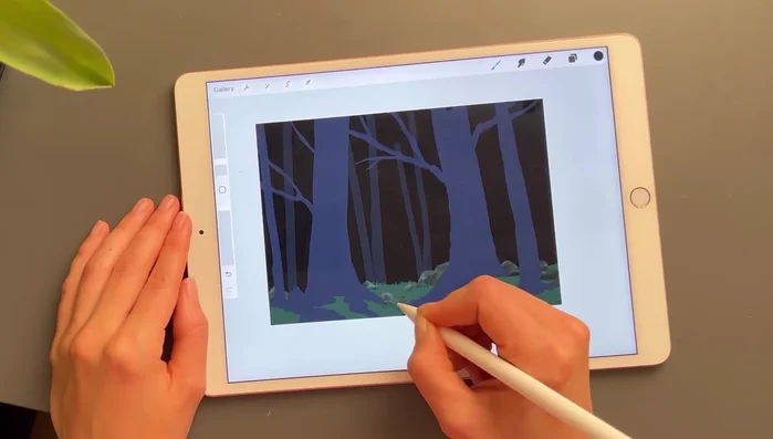
- Add a layer between trees for the background, using dark greens to work towards lighter shades.
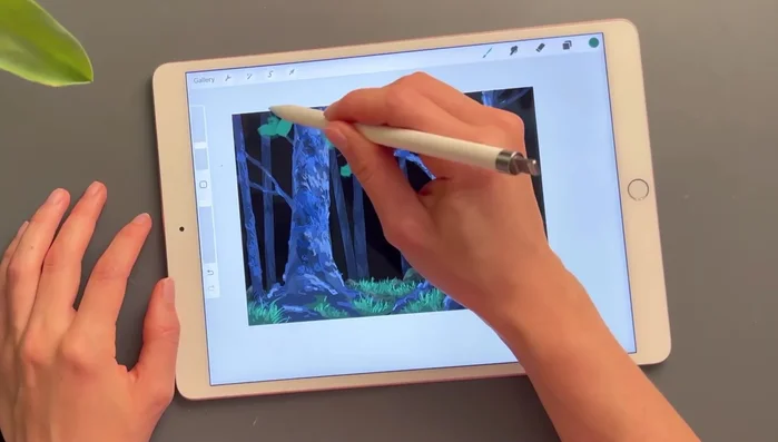
Layering the Background Adding Midground Details
- Add shading to rocks using a clipping mask and lighter colors.
- Add grasses using the studio pen for defined shapes.
Adding Midground Details Refining the Foreground
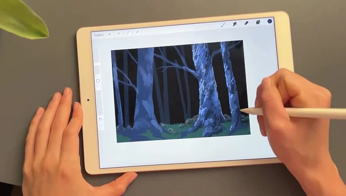
- Add lighter shades and colors to details using the studio pen without a clipping mask.
- Adjust trees using the studio pen and old brush for texture.
- Add lighter shading to grass with a 6B brush or pen.
- Add highlights to grass with a lighter color.
Refining the Foreground Adding Final Touches
- Add foliage and bright assemblies to trees, using the old brush for texture and blurring hard lines.
- Add final details, lighting, and signature.
Adding Final Touches


Read more: 7 Top Paint Color Trends for 2024: A Complete Guide with Free Downloadable Resource
Tips
- Use many layers to avoid accidental erasures.
- Work from dark to light colors, especially with a dark background.
- The Studio pen is helpful for creating defined shapes in details.
- Use the old brush for leaf texture.