Have you ever longed to create beautiful artwork but felt intimidated by the seemingly complex world of painting? Pastel painting offers a wonderfully accessible entry point, allowing for vibrant, expressive pieces even with minimal experience. Forget the hours spent perfecting technique – this tutorial shows you how to capture the stunning beauty of a pear in just five minutes! Using simple strokes and readily available materials, you'll be amazed at how quickly you can achieve a captivating result. The soft, blendable nature of pastels makes them perfect for beginners, forgiving imperfections and allowing for a quick and satisfying creative process.
This isn't about photorealism; it's about capturing the essence of the fruit, its smooth curves and subtle color variations. Ready to unleash your inner artist and create a gorgeous pastel pear? Let's dive into the step-by-step guide and discover how effortlessly you can achieve this mini-masterpiece in just five minutes!
Preparation and Safety Guidelines
- Canen un-sanded pastel paper
- Prismacolor NuPastels (or similar soft pastels)
- Charcoal pencil
- Always work in a well-ventilated area. Pastel dust can be irritating to the lungs.
- Protect your work surface. Pastels are messy; use a drop cloth or protective covering.
- Fixative is your friend! Use a workable fixative spray between layers to prevent smudging and preserve your artwork.
Step-by-Step Instructions
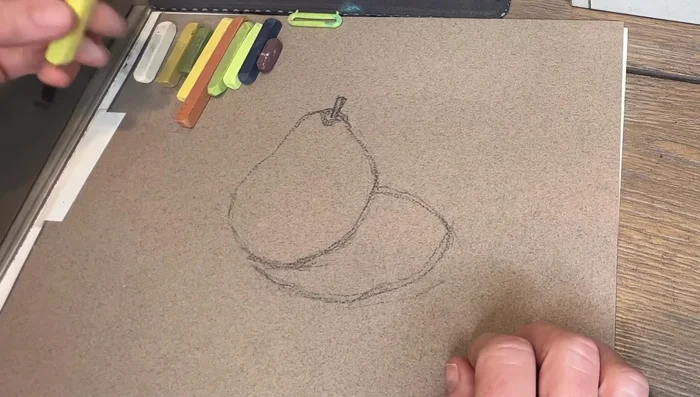
Sketching the Pear
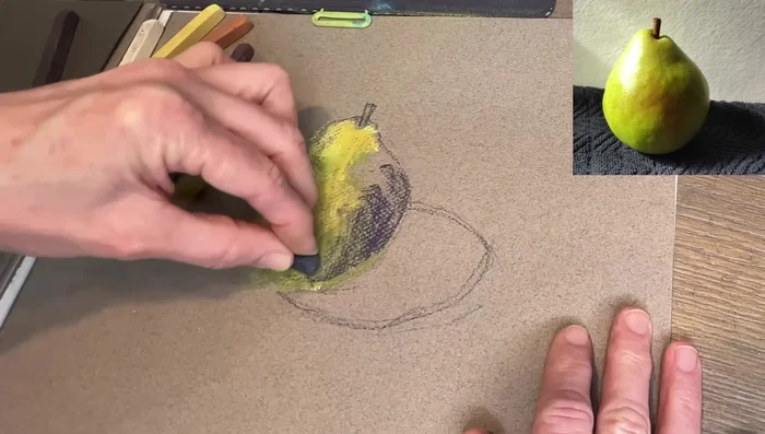
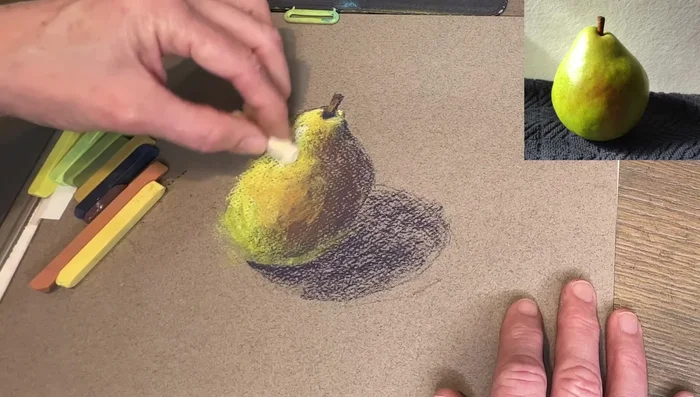
- Sketch the pear shape lightly with a charcoal pencil.

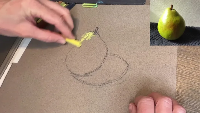
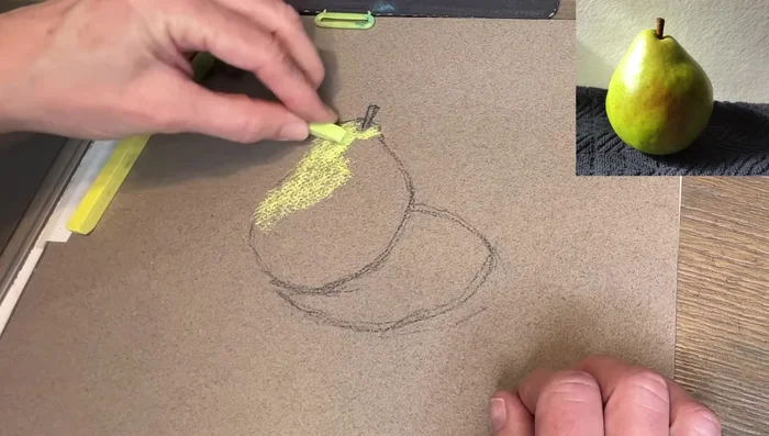
Sketching the Pear Layering Light Values
- Apply light lemony yellow to the lightest areas of the pear (left side).
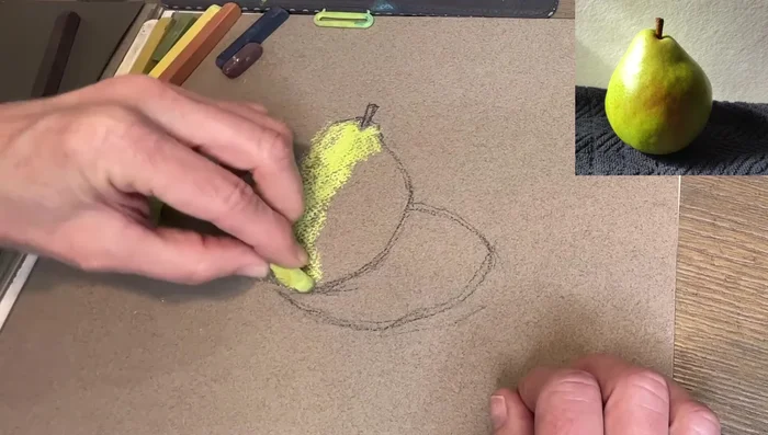
- Gradually add slightly greener pastels, moving towards the shadowed areas. Blend softly to avoid harsh edges.
- Introduce a warmer green to the areas transitioning to shadow.
Layering Light Values Introducing Shadow
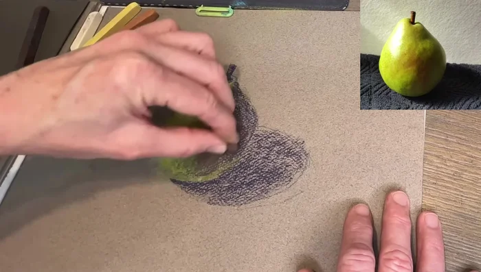
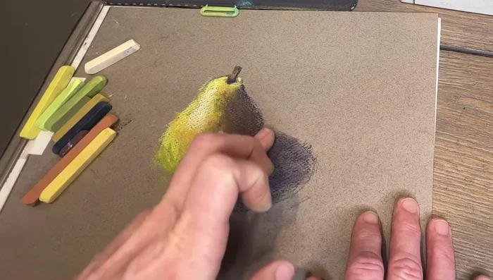
- Add a darker, blue-gray to the shadowed areas (bottom and right side).
Introducing Shadow Softening and Warming Shadows
- Incorporate a brownish tone to soften the dark areas and add warmth.
- Use a rusty color to blend the light and dark tones, softening edges further.
Softening and Warming Shadows Adding Highlights
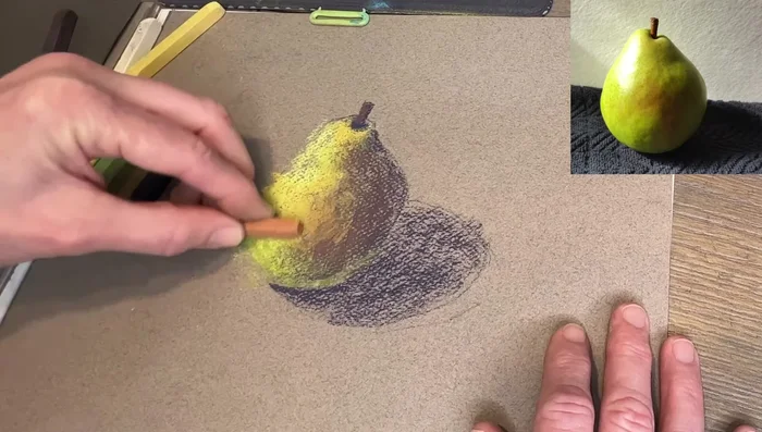
- Add a lighter yellow to enhance highlights where light reflects.
- Apply a final highlight color to emphasize the light source.
Adding Highlights Blending and Finishing
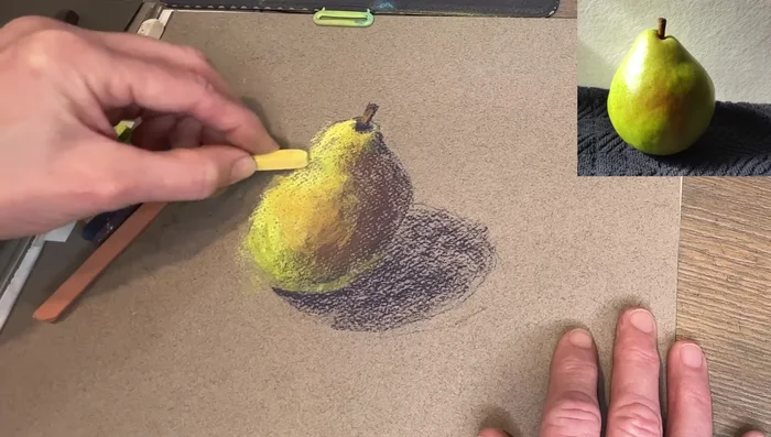
- Lightly blend with your finger to soften the texture and create a painterly effect (optional).
Blending and Finishing
Read more: 7 Top Paint Color Trends for 2024: A Complete Guide with Free Downloadable Resource
Tips
- Use soft edges to create a more painterly look.
- Don't press too hard to allow for layering.
- Use gestural strokes and turn the pastel on its side for broader application.
- Gently blow away excess pastel dust to avoid inhalation.
- Focus on values (light and dark) more than precise color matching.