Pastel landscapes offer a vibrant and expressive way to capture the beauty of the natural world, and few subjects are as captivating as the interplay of rocks, sky, and sea. The rough texture of coastal rocks, the vast expanse of the ever-changing sky, and the graceful flight of a lone seagull – all combine to create a scene brimming with potential for artistic interpretation. The soft, blendable nature of pastels allows for a unique approach to depicting these elements, capturing both delicate detail and sweeping atmospheric effects with equal ease.
This guide will lead you through a step-by-step process of creating your own pastel landscape featuring these stunning elements. We'll explore techniques for laying down base colors, blending smoothly, achieving realistic textures in the rocks, and capturing the subtle gradations of light and shadow in the sky and water. Prepare to be amazed by how easily you can bring this evocative coastal scene to life on your paper.
Preparation and Safety Guidelines
- Pastels
- Pastel Paper
- Fingers
- Spray Fixative
- Pastel Pencil
- Always work in a well-ventilated area when using oil pastels, as the fumes can be strong.
- Oil pastels can be messy. Protect your work surface with newspaper or a drop cloth.
- Oil pastels are blendable, but once dry, they are difficult to remove. Plan your composition carefully before starting.
Step-by-Step Instructions
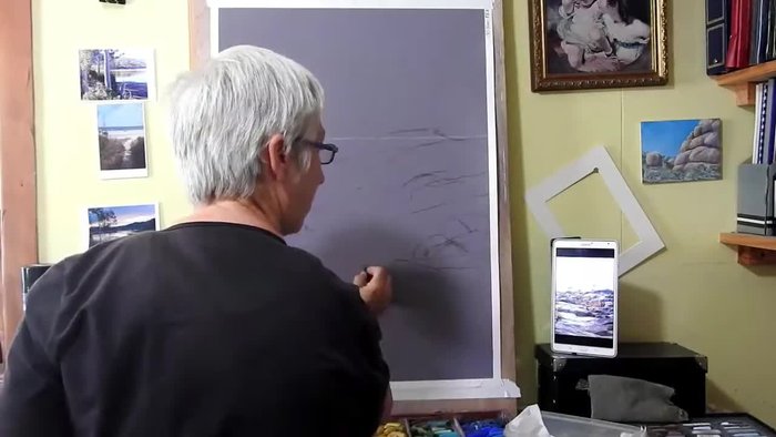
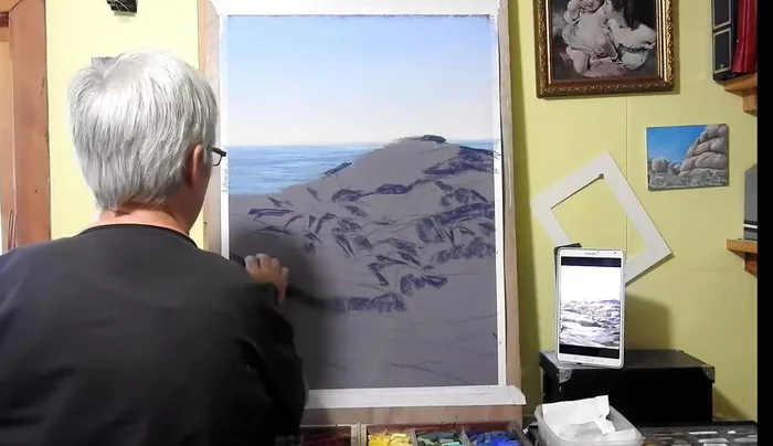
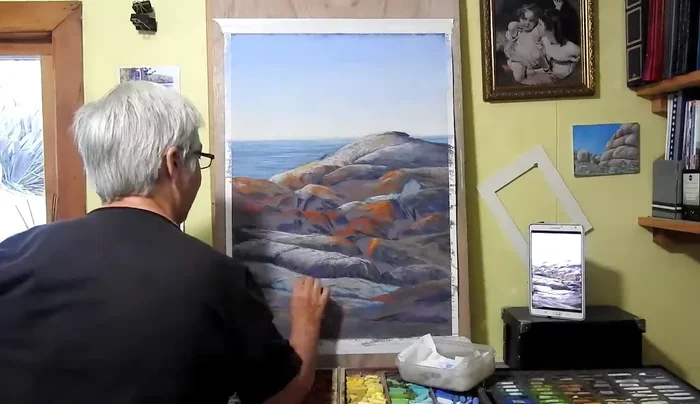
Sketching the Composition
- Blocking in the general shapes of the rocks. Don't worry about exact duplication of the reference material.

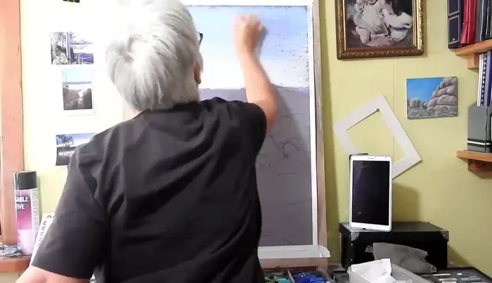
Sketching the Composition Layering the Sky
- Laying in the sky with light washes, using deeper blues as you move upwards.
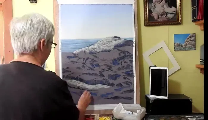
- Blending colors using fingers to aid in the process. Push harder with lighter colors into darker areas, and vice-versa.
- After blending, go back over with the same colors to restore some sparkle.
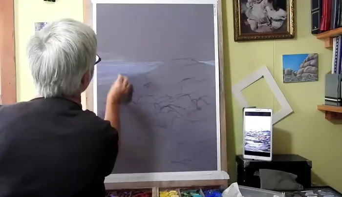
Layering the Sky Establishing Rock Shadows and Highlights
- Laying in the shadows of the rocks darkly first, using the reference photo for guidance.
- Adding lighter highlights (grays and lighter colors) to the tops of the rocks, blending with the hand in the direction of the rock shapes.
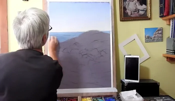
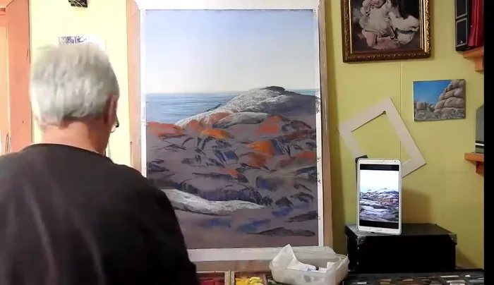
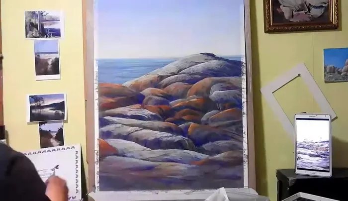
Establishing Rock Shadows and Highlights Adding Color and Texture to Rocks
- Adding brighter orange colors for lichens, and then darker colors in shadowed areas. Continue blending colors by pushing one into another.
- Adding variety in colors to keep the painting interesting. Use one color in multiple areas to unify the painting.
- Building up rock forms by adding more colors and modeling the roundness and smoothness of the rocks. Establish shadowed and brightly lit areas.
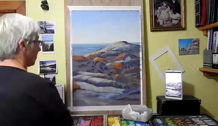
Adding Color and Texture to Rocks Preparing the Surface
- Using spray fixative to restore tooth to the paper to prevent pastel from falling off. Apply only to specific areas needing more grit.
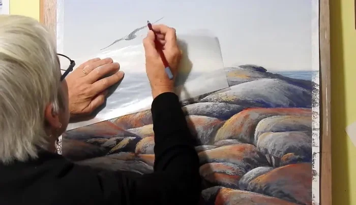
Preparing the Surface Adding the Seagull
- Adding details to the seagull using a pastel pencil for finer lines.
Adding the Seagull
Read more: 7 Top Paint Color Trends for 2024: A Complete Guide with Free Downloadable Resource
Tips
- It's easier to put darks over lights, so start with dark values.
- Blending colors by pushing one into another helps create a unified look.
- Varying colors keeps the painting interesting.
- Using one color in multiple areas helps unify the painting.
- Use a pastel pencil for fine details like the seagull.